The Importance Of Online Reviews


Categories: Web Design

Have you Goggled your company lately and taken stock of your online reviews? Most buyers read reviews before purchasing online, and what they find influences their buying decision. Negative reviews can hurt your conversion rates, and no reviews can make it tough to compete online. So how do you build your positive, honest online feedback?

You start with a great product and excellent customer service. Listening to your customers will let you know if they are happy with the products or services you are providing.
Read more

Quick Guide To Creating Website Content


Categories: Web Design

Last week I wrote about our “Must-Read Tips For Your Website Project” which included a section on creating website content. Copy writing is a preeminent part of any website project, and many of our clients here at Oracast craft their own content.

If you are in the process of creating content for your new website, here are my top quick tips for you:

  • 1. Grab your audience’s attention with captivating headlines and opening paragraphs. You only get one chance to make a first impression and you need to nail the intro. I find reading The Top 100 Headlines of All Time inspiring when I hit writers block.


  • 2. Get inside your customers head. What problems, pain, frustrations is your business solving? Answer these questions for your clients: What’s in it for me? Why should I believe you? Are you proving that you’re an expert? An authority? Are you trustworthy? Why should they choose you over a competitor?


  • 3. Create a list of benefits that you offer. What are the results and advantages you offer clients? Make sure that your customer has all of the information that they are looking for and don’t forget to highlight the key messages that will help them make a decision to hire you. Will you save them money? Make them money? Make their lives easier?


  • 4. No one knows your product / services better than you do. Speak from your personal experience. Gather stories and tell them to your clients. Don’t just talk about facts and details. Speak to the heart and inspire using stories. “Facts tell, stories sell.” How has your product / service made a difference? Saved time? What was the outcome?


  • 5. Don’t be afraid to let your personality shine through. Write as if you are talking to a friend. Think of one person who would be an ideal client and write your content as if you are speaking to that one person.


  • 6. Always have a clear call to action on every page. What step would you like your website visitors to take next? Would you like them to email you? Call you? Click to the next page? Make it clear where you are directing your website visitors.


  • 7. Make your offer irresistible. Offer guarantees. Remove as much risk as possible from the buying decision.


  • 8. Provide social proof such as testimonials with pictures, client logos, or TV/media appearances. Build credibility and trustworthiness through your loyal fans (with their permission of course).


Those are my top copy writing tips for today! Happy writing!

Google Analytics: 3 Tips to Understanding your Metrics at a Glance


Categories: Web Design

Google Analytics and Web Master Tools are important and useful tools in tracking website statistics. Unless requested otherwise, Oracast set’s up every website we launch with access to these free tools. We’d like to help our clients get the most out of these readily available statistics.

So, once your website is launched and your analytics tools are in place, how do you use these tools to your advantage?

google

Google analytics reflects three main metrics: acquisition, engagement and outcome. Today I would like to focus on engagement. How do you know your website is reaching the right audience and engaging your visitors?

Here are a few metrics we like to look at:

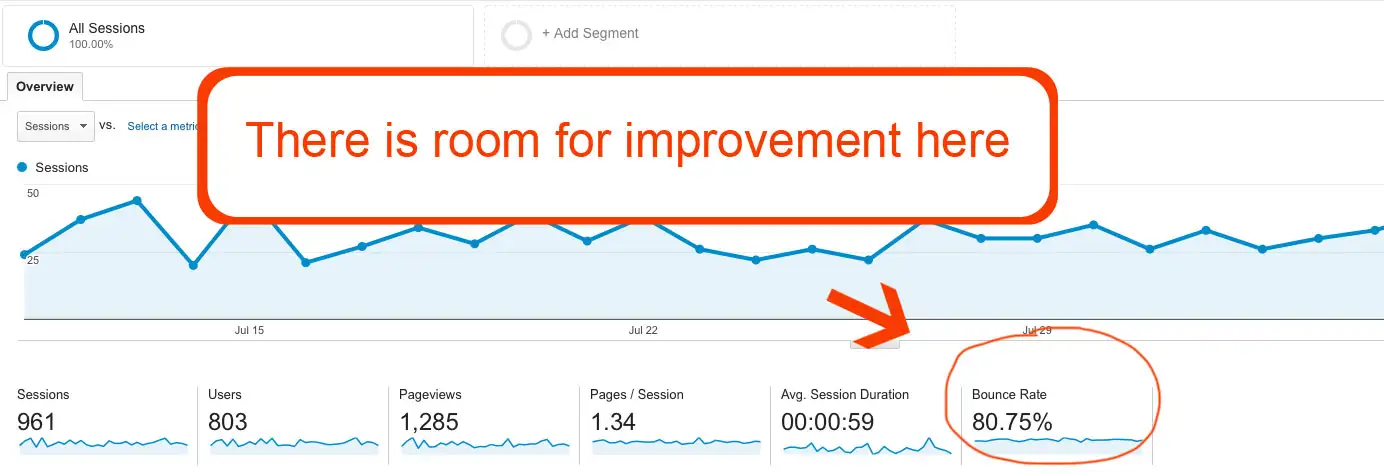
  • Bounce rate   (Ideally below 60%)
  • Time on site (Above 60 seconds indicates an engaged visitor)
  • Page views   (The more, the better. Take note of which pages are trending)
  • Pages per visit   (The more, the better. Note blog pages)

#1 Landing Page:

One of the first statistics to check out is your homepage is your bounce rate. This will give you a good indication of how many of your visitors are sticking.

You have less than 5 seconds to capture your visitor with a clear message about why they are looking at your website, or they’re gone.

One of the main reasons people ‘bounce’ off websites is because of a lack of clarity. If your homepage bounce rate is above 60% it’s time to take a second look with fresh eyes. Show your website homepage to a few people who have never seen it before and ask them what your company does after 5 seconds. Do they know the answer?

OracastGoogleAnalyticsExample

Here is a good example of a clear landing page. Within 5 seconds it’s easy to tell Hootsuite is a social media management tool.

hootsuite


The top of the page is where visitors eyes land first. I usually recommend a clear headline supported by an image that quickly and clearly communicates what your company does.

#2 Popular Content

Take a look at what pages visitors are spending the most time on. This will help you to determine what content they really want from your website.

If visitors are staying on a page for more than 60 seconds, it’s a good indication that they are engaged.

Make note of the pages with the highest time spent and which pages have the most visits. This can be found under Behavior > Site Content >

analyticsAlso look into your blog article statistics and determine which topics are the most popular and helpful to your visitors. Another way to find out which content is the most popular is by looking at the keywords people typed in to find your website in the first place. What are the most popular keywords on your site?

Increasing your engaging content will entice visitors to stay on your website longer and return again and again. Ultimately if you are providing content people are looking for, the number of visitors to your website will grow over time.


#3 Growth Patterns

Start with the default 30 days, and then change the date range to 3-6 months, and 1 -2 years (if available), and compare. Looking at the long term statistics will help you pick up on larger trends. Are there certain times of the year your traffic spikes or dips such as holidays?

Untitled

It’s a good sign if there is a growing trend such as an increasing number of unique visitors, page views and time on site over the long term. If the patterns are decreasing, there may be some gaps in your content or SEO strategies.

Reach Your Online Goals

There are many important things you can discover about your website and audience by taking a look at your Google analytics. We recommend signing into your analytics tools at least once every three months and measuring up the stats to your goals.

We are here to help you reach the goals you’ve set-out to achieve. Let us know if you have any questions about your website’s analytics and we will be happy to help!

9 Ways To Improve Your Website


Categories: Web Design

1. Establish Value

The website visitor should be able to figure out at a glance what you do. Ideally a catchy headline, backed up by images will let your web traffic know what you’re about and why they should care. Everyone is busy, and there needs to be a clear reason for your visitors to stick around. A well thought-out and designed homepage will answer the biggest questions up front and draw them in with clear offers and benefits.

Think about these key questions as you develop content for your website: What problem are you solving? What’s in it for them? What will they get when they hire you? Why should they subscribe to your newsletter or read your blog?

Oracast Example Image

2. Stay Action Focused

Make sure there is one main call to action (CTA) on every page. Having more than one call to action can sometimes work, but it’s best to limit the CTA’s to one per page. This makes it more obvious to the visitors what to click on next and brings them more directly through your sales funnel.

Here’s an example of a website we did for Easy Buy Canada.

As you will see, the CTA is on the right hand side which links to a form, and there is a clear headline at the top of the page next to the logo.

easybuy

3. Color Does Matter

Finding a contrasting color for your call to action buttons can increase conversion rates. If your website is mostly purple, your call to action button will stand out best if it’s green, for example. Red, blue or yellow can work well for “Buy Now’ buttons as long as they contrast with the page. Amazon uses a yellow CTA button, so most shopping carts use yellow.

color_wheeloracast

4. List The Benefits

Be clear about what is in it for your clients. A great way to do this is by creating a bullet point list of the benefits. This is very different than a list of features. Features is a more technical (and potentially boring) list of the why and how. What your clients are looking for are the benefits to them. How will your solution solve their problem/improve their lives/save them time/money/make them feel better? This can also be done in a video format.

After reading this list of The Benefits of Oranges, you may want to eat one next time you get a chance!

orangebenefits

5. The Five Second Rule

Open up the website you are working on after several days of not viewing it, and stand back. What catches your eye first? Where does your eye go next on the page? What stands out? Is it conveying the clear message you would like it to? Get other people to look at your website as well, and offer you their first impressions. Ask yourself, “If I was a prospect, would I act on this page?”

Take a look at vwo.com as an example. You can bet this landing page is highly optimized. There is a clear call to action that immediately catches the eye. You will notice in the example below, the bright orange CTA button stands out against the dark purplish/gray background. There is a clear headline at the top of the page, an image, and a list of benefits “5 reasons you should…”

optimizedwebsiteexample

6. Responsive Web Design

Wikipedia: “is an approach to web design aimed at crafting sites to provide an optimal viewing experience—easy reading and navigation with a minimum of resizing, panning, and scrolling—across a wide range of devices (from desktop computer monitors to mobile phones.”

Having a responsive website has just become critical with Google’s April 2015 algorithm update, as Google will now be rewarding a higher Google ranking to sites that comply with their mobile-friendly rules.

Mobile phone searches have now tipped the scales on regular desktop “Googling”, so it’s more important than ever to have a site that is easy to use on smartphones.

7. Testimonials

Nothing sells your story better than smiling faces, and raving reviews. Getting testimonials on video from your clients can be very motivating. The videos can play automatically on specific pages (such as a register for an event page) or they can be scattered through the site. It’s a great idea to include a few testimonials on the homepage for social proof and just another reason to keep those website visitors clicking through your site.

Here’s a few examples of testimonials from a site we designed for www.execsintheknow.com:

EITK Homepage
A lot of visitors don’t take the time to visit the testimonials page specifically, yet they are a very important selling feature, so it can be a great idea to have a testimonials page, plus scatter testimonials through-out the site.
EITK Testimonials

8. Social Media

There are many awesome benefits for including social media in your marketing plan, and I will list a few here.

A. It improves your SEO. Having Facebook, Twitter, Linkedin, YouTube, Google+ accounts (and more), will improve your SEO rating and increase traffic to your website.

B. Social media is a great way to learn about your target audience and target them more effectively and directly.

C. It’s very cost effective. For little to no budget, you can build relationships, reach new clients, increase brand awareness, and get your message heard and shared.

Google+

9. Traffic and Getting Your Website Found

Increasing website traffic is key to any business and competition is sometimes fierce. There are many things you can do to help your SEO ranking such as having a blog, social media, knowing your target audience and keywords. One of the more effective ways to get to the top however, is simply through PPC ad campaigns. PPC advertising is often overlooked as being ineffective or too expensive, but it is an excellent way to grab traffic and get you a top spot on the page and, if done right, is usually profitable.

We offer a variety of solutions for traffic generation, from SEO packages to PPC advertising and social media campaigns.

compete.com

Domain Registry Of Canada SCAM


Categories: Web Design

What is the “Domain Registry of Canada Scam?”

A company called Domain Registry of Canada sends out old school snail mail letters designed to appear as an official government organization. The letter will appear as an invoice urging the domain to renew their domain immediately with the warning “failure to comply will mean losing your domain”.

THIS IS NOT A REAL INVOICE! IT IS A SCAM!

As you can see by this image below they strive to make this document look as real as possible.

domain-registry-canada-scam

If you receive a notice for domain renewal through the mail always be safe and contact the company you purchased your domain from directly.

Domain Registry of Canada has used many company names such as “Internet Registry of Canada”, “Domain Renewal Group” and “DROC”. They always use the same technique to try to fool you into transferring your domain away.

When you purchase a domain your information is put into a domain name registration and can be viewed publicly though a whois database. They are able to view the owner name and address associated with the domain registration. Once they have this information they simply send a fake invoice and wait for people who do not fully understand how domain registration works; falling pray to their scam. These fake invoices look very real and without the proper knowledge it is easy to fall for this trick.

Using a the threat of losing your domain in there invoice is just a ploy. You do not want to do anything other than throw this fake invoice into the garbage. These fake invoices say that they are to renew your domain when in fact they are trying to get you to transfer your domain to them.

They are actually a legitimate domain registrar using unethical business practices to trick people. Once the domain is transferred you will no longer be doing business with your original registrar whether it was GoDaddy, Network Solutions, OpenSRS or any other registrar company.

Once you have transferred your domain over to Domain Registry of Canada you will then be privy to their renewal costs which are substantially more than most other companies.

If you have any negative experience with the DROC scam, pleas report the Domain Registry of Canada Scam to the BBB.

Why coding standards are important


Categories: Web Design

A perfect axiom of coding standards is summed up by “don’t judge a book by its cover.” Sure the website may look great on the outside to the average visitor, but under the hood can tell a very different story. The underlying code, when following “best practice” coding standards, is quite easy to work with especially when a customer would like to expand the features of their website. Unfortunately, in our experience, many web designers don’t follow any coding standards and it is a nightmare to maintain, which ends up costing the customer more time and money.

As a business owner or manager who is looking for a website, make sure to ask the company if they follow any specific coding standards such as W3C. Making sure that your website follows best practice coding standards will help make your website more accessible to many different web browsers and devices, but more importantly, it will help insure that your future maintenance costs are minimal. In addition, if you ever fire your existing web provider and hire someone new to take over, the new company has to understand and work with the code, so if it’s terrible code it will take them longer to update your site and cost you more money, however, if your website is written with coding standards that are easy to read and understand, the new company will be off to the races in no time.

Here at Oracast we employ best practice coding standards to ensure that your website will look great and function properly in all major web browsers, and help minimize your maintenance cost by providing quicker and easier maintenance implementations. Don’t hesitate to contact us for a free consultation.